100% reduction in engineering dependency for content changes
4x Faster content deployment
50+ New components shipped into the design system

April is an AI-powered platform that helps US users file taxes with less friction. The customer-facing app is what most people see - but my work lived behind it, on the internal tool the team uses to build and manage those app screens. I was the sole designer on this, from a blank Figma file to a shipped, daily-use tool.
Every screen change - even fixing a typo or reordering two buttons - needed a developer. For a tax product, that's a bigger problem than it sounds: US tax rules shift constantly and vary by state, so the content team was stuck queuing engineering tickets for changes that had nothing to do with engineering.
What the team needed wasn't a faster ticket queue. It was to take developers out of that loop entirely, without handing non-technical people a tool so complex it just created a different kind of bottleneck.
Designing complexity that non-technical people could actually use
A no-code builder for simple screens is a solved problem. This one wasn't simple. Three things made it hard.
Conditional logic without code
Screens needed to appear based on user data - show this step only if filing status is "Married Filing Jointly," for example. That's programming logic, and the people using the tool don't code. I designed a visibility-rule editor that let them build these conditions in plain, structured language instead of syntax - powerful enough for real conditions, simple enough that a content manager wouldn't be intimidated by it.

Structure they could hold in their head
Complex screens have nested layers. I designed a layering system so people could see and manage the structure of what they were building without losing track of where they were

Safety to experiment
People building live app screens need to undo, compare, and recover. I built timeline with version history so no one was ever one wrong click away from breaking something already live

The decision I had to defend
Early on, we didn't really know what this should look like. I explored a handful of directions with GetApril's in-house senior designer - different layouts, different metaphors for "building" a screen. The one that made the most technical sense was a structured, graph-style builder, closer to a logic flowchart than a canvas. It mirrored how the system worked under the hood, and it would have been the simpler build for engineering.
It just wasn't testing well against how people actually think, so I changed how I was working. Instead of refining ideas in the design room, I sat down with the actual users - about 30–40 people across GetApril's payroll and management teams - and asked a simple question: what do you already use day to day? Almost everyone said the same thing: Miro. They drafted constantly, and a free-form artboard was already how they thought about laying things out.
That reshaped the direction. At the next design review, I pushed for a loose, artboard-style canvas instead of the graph-style builder the team had been leaning toward. It meant more work translating a free-form canvas into something engineering could implement reliably - a harder build than the "correct" version on paper. But it meant the tool matched how people already worked, instead of asking them to learn a new way of thinking. That's the version that shipped, and it's a big part of why non-technical teams actually adopted it instead of avoiding it

Building it
From there, it moved from low-fidelity flows - testing the building logic before any visual design - into high-fidelity UI, then several rounds with internal users, refined against the real habits I'd already seen at the artboard-vs-graph stage.
User Journey & Flow
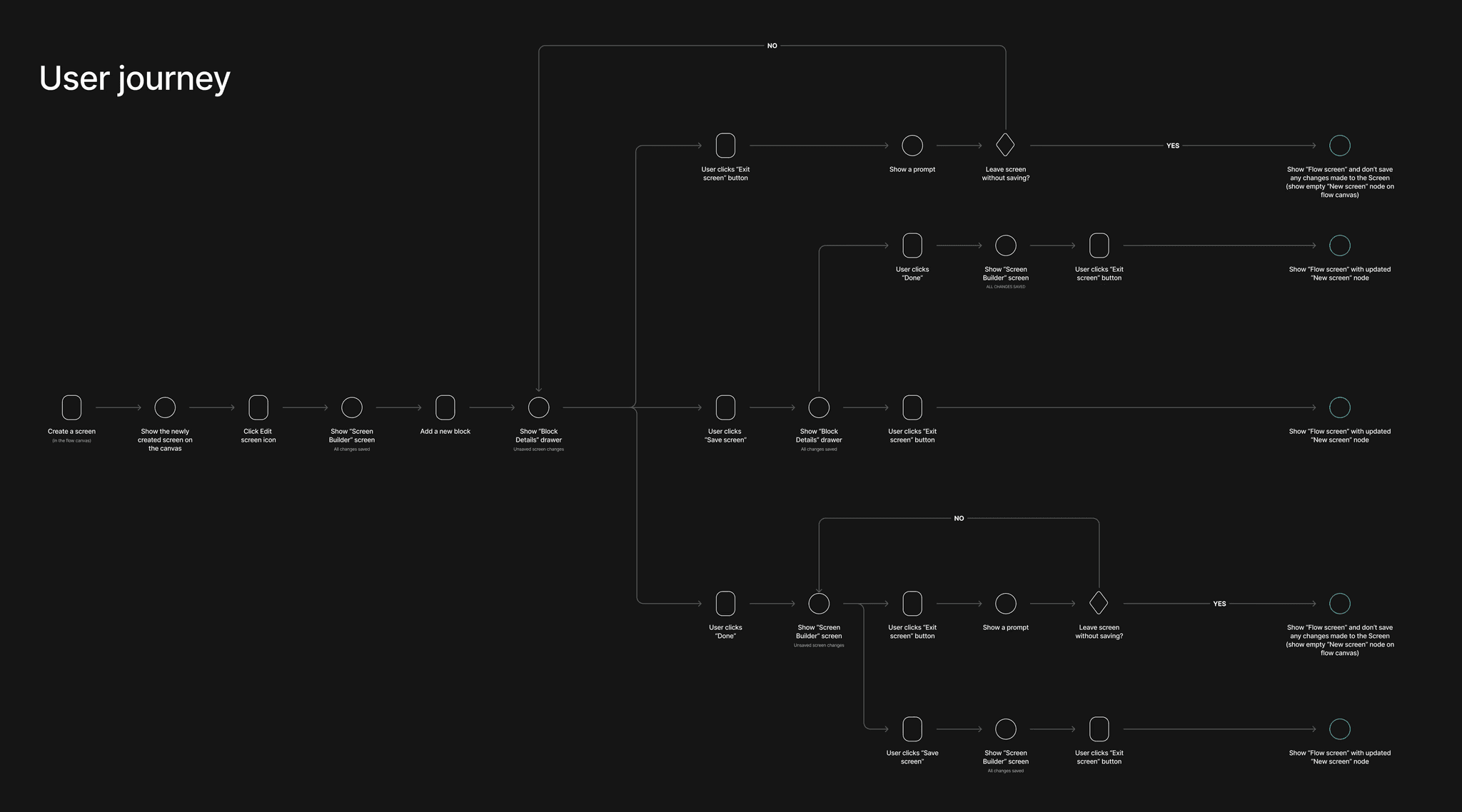
The hardest part of this project wasn't designing how someone builds a screen - it was designing how they leave one. A user could exit with unsaved changes from several different points, and each needed its own response. Mapping this early surfaced the tricky edge cases before I designed a single component.
Including concepts which didnt work
Before the shift toward a Miro-style canvas, the early instinct — mine included — was the structured, graph-style builder. It made sense on paper: it mirrored the system architecture and would have been simpler to build. It just didn't match how the actual users thought, which only became obvious once I sat down with them.

The final layout had to make three things instantly clear: what goes where, what's editable, and what happens next. Everything else - the visibility-rule editor, the layering panel, version history - sits inside that same simple frame, so the tool feels like one coherent product rather than three separate features bolted together.


Extending the design system
Most of this tool could lean on April's existing design system - buttons, inputs, and layout primitives were already there. But a screen builder isn't like most products, and I kept running into gaps the existing library was never built to cover: the visibility-rule editor, the layering panel, the artboard canvas itself - none of that existed yet.
Component work became part of the design process, not a separate step after it. Whenever the existing system hit its limit, I designed the missing piece to match the same tokens and patterns as everything else, then folded it back in. By the time the tool shipped, I'd added 50+ new components - built to be reused well beyond this one project, not just patched together to make the builder work.

